
The range of plausible futures, and why scientists give ranges rather than single numbers.
📊 Why projections come as ranges, not predictions
Future warming depends on how much more greenhouse gas humanity emits, which in turn depends on choices that haven't been made yet. So scientists model several plausible pathways, called emission scenarios, rather than predicting one future.
🔑 The key point: The gap between low and high isn't uncertainty about the physics. It's uncertainty about what people, businesses and governments actually do over the next 75 years. Lower emissions mean lower warming.
🌍 The IPCC's scenarios
The IPCC, the UN body that assesses global climate science, sets out five scenarios in its latest major assessment (2021), from very low future emissions to very high. This page shows the three that best illustrate the range: low, middle and high, rather than all five. Each gives a range of likely warming by 2081–2100, compared to the 1850–1900 baseline.
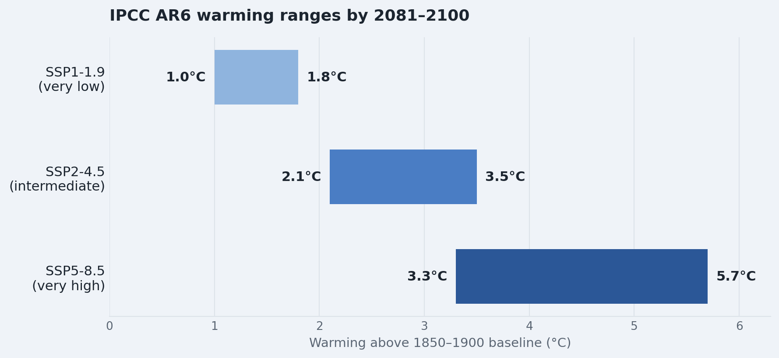
📊 Source: IPCC AR6 Working Group I, Summary for Policymakers, 2021. Ranges shown are the "very likely" range for each scenario, relative to 1850–1900.
| Scenario | What it assumes | Warming by 2081–2100 |
|---|---|---|
|
SSP1-1.9 (very low emissions) |
Emissions fall to net zero around or after 2050 | 1.0–1.8°C |
|
SSP2-4.5 (intermediate emissions) |
Emissions roughly level off mid-century | 2.1–3.5°C |
|
SSP5-8.5 (very high emissions) |
Emissions roughly double by 2050 | 3.3–5.7°C |
🇬🇧 What this means for the UK
The Met Office's UK Climate Projections (UKCP) apply the same logic locally to rainfall, temperature and sea level by region. Their own summary points to a greater chance of:
- 🌧️ Milder, wetter winters
- ☀️ Hotter, drier summers
- 🌊 Sea levels continuing to rise
🔍 Try it yourself
The Met Office and BBC built a tool that shows how your own postcode's hottest and wettest days could change under different levels of warming.
What will climate change look like near me? → BBC / Met Office postcode tool
💡 The honest summary
Every scenario above shows warming continuing. None shows temperatures stabilising or falling. What varies is how much and how fast, and that's still within our collective control.
See what we can do, covering adaptation and mitigation from community scale to household scale.